When designing with Divi by Elegant Themes, you might find yourself using alternating row layouts—an image on the left and text on the right in one row, then the opposite in the next. This creates a visually appealing layout on desktop, but when viewed on mobile devices, the experience can be a bit jarring. Typically, the images and text are stacked in their original order, leading to situations where you might have two images or text blocks stacked together, breaking the flow.
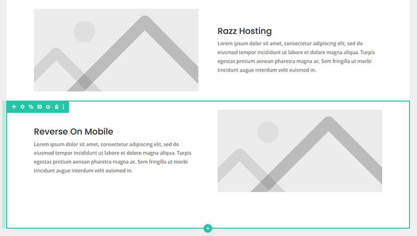
For example, let’s say you have a section of your site where Row 1 features an image on the left and text on the right, and Row 2 reverses this with text on the left and an image on the right. On mobile, these elements will be displayed vertically. But instead of alternating image and text, you may end up with both images stacked together, followed by both text sections.
Luckily, with Divi, there’s a simple fix to make the design flow more naturally on mobile devices. You can reverse the column order on mobile devices using a bit of custom CSS.
Why Does Reversing Column Order Matter?
When content is stacked in a repetitive manner, it can interrupt the visual hierarchy and the message you’re trying to communicate. Reversing the column order allows the user to view the content as it was intended: with the image leading into the text in a natural flow (image, text, image, text), rather than in chunks that could be confusing.
This creates a cleaner, more user-friendly design on mobile.
How to Reverse Column Order in Divi on Mobile
Here’s a simple step-by-step guide to achieve this.
Step 1: Add a Class to Your Row
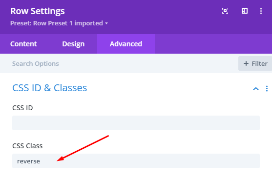
In Divi, you can target specific rows where you want to reverse the column order. To do this, we’ll add a custom class to the row.
- Open the Row Settings for the row you want to modify.
- Navigate to the Advanced tab.
- In the CSS Class field, add the class
reverse. This will allow us to target this row with custom CSS.
Step 2: Add Custom CSS
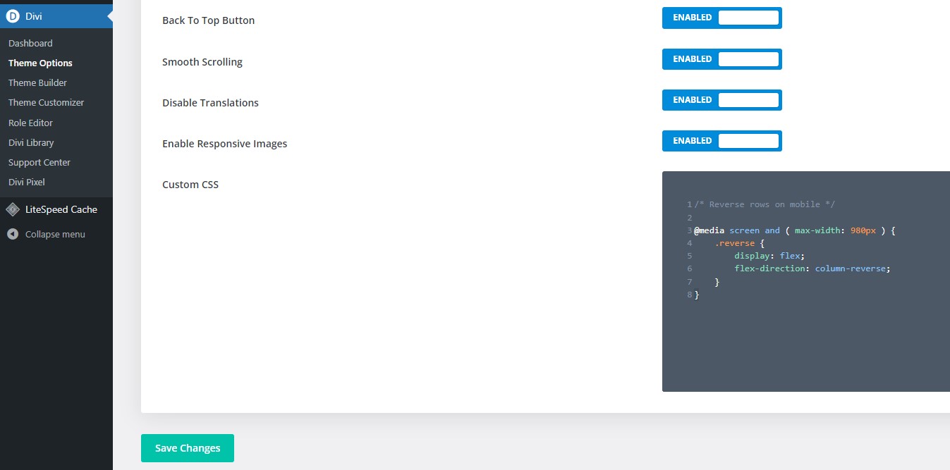
Next, we need to add the actual CSS that will reverse the order on mobile devices. Here’s how to do it:
- Go to Divi Theme Options.
- Scroll down to Custom CSS.
- Add the following code:
/* Reverse rows on mobile */
@media screen and ( max-width: 980px ) {
    .reverse {
        display: flex;
        flex-direction: column-reverse;
    }
}
This code will tell browsers to reverse the column order for any row with the class reverse on screen sizes below 980px (the typical width of most tablets and mobile devices).
What Does This CSS Do?
- The
@mediarule ensures that the style is only applied on devices with a screen width of 980px or less (essentially tablets and phones). display: flex;enables a flexible box layout for the row, which allows for better control of how elements are ordered.flex-direction: column-reverse;reverses the order of the columns, so on mobile, the image will appear under the text, or vice versa, depending on your layout.
Why Use This Approach?
While Divi offers powerful visual editing options, sometimes a little custom CSS can go a long way in giving you the flexibility to achieve exactly what you want. By using this method, you can:
- Ensure that your website looks polished and professional on all devices.
- Prevent odd layout issues, such as two images stacking on top of each other.
- Improve user experience by maintaining a logical flow of content on mobile.
Final Thoughts
Understanding how to customize your website to improve user experience is key to providing a polished and functional design. By reversing the column order on mobile, you can ensure your site not only looks great but also delivers your content in a more engaging and accessible way.
Stay tuned for more Divi tips and tricks, and if you ever need help managing or optimising your WordPress website, our WordPress Care Plans are designed to keep your site running smoothly and securely. Drop us a message to see how we can help you today!

